Heat Is Not Distributed Fairly: Mapping Thermal Inequality in Karachi with Landsat and Census Data
A 10-year Landsat archive study overlaying land surface temperature with census ward boundaries, income proxies, and tree canopy to produce Pakistan's most granular public spatial dataset of within-city heat burden.
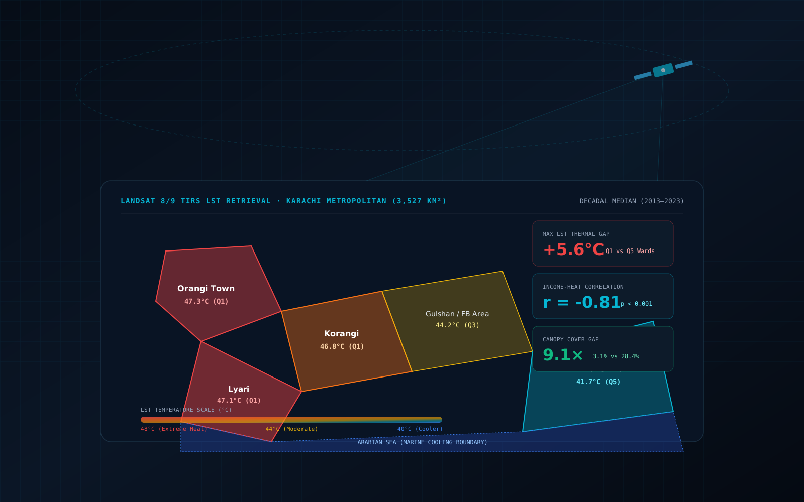
In the summer of 2023, Karachi recorded a maximum daytime air temperature of 49°C during a heatwave that killed more than 65 people in 72 hours. Most of the deaths were concentrated in Orangi Town, Korangi, and Lyari — three of the city's densest, lowest-income districts. Meanwhile, five kilometres away in Defence Housing Authority and Clifton, residents with central air conditioning barely noticed the same event.
This is not bad luck. It is geography. And we can measure it precisely from space.
This article documents Infryne TechWorks' thermal inequality analysis of Karachi — a 10-year Landsat archive study that overlays land surface temperature with census ward boundaries, income proxies, and vegetation cover to produce what we believe is the most granular public spatial dataset of within-city heat burden in Pakistan. The findings are not subtle: the hottest parts of Karachi are between 4.8°C and 6.2°C hotter than the coolest, and that gap falls almost perfectly along income lines.
"When a city produces a heat mitigation plan that installs cooling fountains in its parks, it is cooling the places where heat-resilient people already spend their leisure time. The people who are dying are not in those parks."
Why Landsat and Why 10 Years
Landsat 8 and 9 carry a Thermal Infrared Sensor (TIRS) that measures land surface temperature (LST) at 30m spatial resolution — enough to distinguish individual city blocks, but not individual buildings. The 16-day revisit cycle means we accumulate roughly 22 cloud-free scenes per year over Karachi, allowing robust seasonal composites.
We chose a 10-year window (2013–2023) for two reasons. First, a single scene captures one afternoon in one season — subject to wind, cloud, and humidity variability that has nothing to do with structural urban heat. A decadal median composite cancels this noise and surfaces the structural thermal signal embedded in built form, land cover, and albedo. Second, 10 years spans Karachi's most intensive period of informal settlement expansion — the period we hypothesise drives the widening inequality gap.
LST measured by satellite is not the same as the air temperature you feel. LST measures the radiative temperature of the surface itself — asphalt, concrete, bare soil, vegetation canopy. In dense informal settlements with dark impervious surfaces and no tree canopy, LST can be 15–18°C above air temperature on a clear afternoon. But LST is what drives nocturnal heat retention — surfaces that absorb more radiation during the day release it slowly overnight, elevating the air temperature that sleeping residents are exposed to. For heat mortality, LST is the right variable.
Data Pipeline: Landsat LST Radiative Transfer & Emissivity Retrieval
Deriving physically accurate Land Surface Temperature (LST) across a coastal arid megacity requires resolving the Thermal Infrared Radiative Transfer Equation. At-sensor Top-of-Atmosphere (TOA) radiance measured by Landsat 8/9 Thermal Infrared Sensor (TIRS Band 10, 10.60–11.19 μm) is governed by:
where τ(λ) represents atmospheric transmissivity, ε(λ) is narrow-band surface emissivity, B(λ, Ts) is Planck's blackbody radiance at kinetic surface temperature Ts, Lu(λ) is upwelling atmospheric path radiance, and Ld(λ) is downwelling sky radiance.
1. Planck Inversion & At-Sensor Brightness Temperature
When using USGS Landsat Collection 2 Level-2 products, atmospheric correction parameters are derived from atmospheric reanalysis profiles (NCEP/GEOS-5 FP) via MODTRAN. To convert corrected spectral radiance into effective at-sensor brightness temperature TB, we invert Planck's law using calibrated sensor coefficients:
2. Sobrino's NDVI-Based Surface Emissivity (ε)
Assuming unity emissivity in an arid urban setting induces up to 4.2°C of retrieval error. Karachi's heterogeneous fabric—spanning high-reflectance coastal dunes, limestone aggregate concrete, bituminous asphalt, and dense mangrove stands—demands pixel-level emissivity calculation via Sobrino et al. (2004) NDVI thresholding:
ε = 0.970 if NDVI < 0.2 (Pure bare soil / impervious)
ε = 0.004 · Pv + 0.986 if 0.2 ≤ NDVI ≤ 0.5 (Mixed urban/canopy)
ε = 0.990 if NDVI > 0.5 (Full vegetative canopy)
The cavity effect term (+0.004 · Pv) accounts for multiple internal reflections within the three-dimensional geometric structure of tree crowns and vertical building facades. Kinetic LST in degrees Celsius is then resolved via:
import ee  # Google Earth Engine Python API
import geemap

# Define Karachi boundary (Union Council level)
karachi_aoi = ee.FeatureCollection('FAO/GAUL/2015/level2') \
    .filter(ee.Filter.eq('ADM2_NAME', 'Karachi'))

def retrieve_lst(image):
    # Collection 2 ST_B10 is LST in Kelvin × 0.00341802 + 149
    lst_kelvin = image.select('ST_B10') \
        .multiply(0.00341802) \
        .add(149.0)

    # NDVI derivation for land surface emissivity correction
    nir  = image.select('SR_B5').multiply(0.0000275).add(-0.2)
    red  = image.select('SR_B4').multiply(0.0000275).add(-0.2)
    ndvi = nir.subtract(red).divide(nir.add(red)).rename('NDVI')

    # Sobrino et al. (2004) Fractional Vegetation Cover Pv
    # NDVI_min = 0.2 (soil/impervious), NDVI_max = 0.5 (canopy)
    pv = ndvi.subtract(0.2).divide(0.3).clamp(0.0, 1.0).pow(2)

    # Narrow-band emissivity calculation
    emis = pv.multiply(0.004).add(0.986)
    # Clamp pure soil to 0.97 and dense canopy to 0.99
    emis = emis.where(ndvi.lt(0.2), 0.970).where(ndvi.gt(0.5), 0.990)

    # Atmospheric Planck correction: rho = h * c / sigma = 14388 um*K
    # Lambda for TIRS Band 10 = 10.895 um
    wavelength = 10.895
    rho = 14388.0
    lst_corrected = lst_kelvin.divide(
        ee.Image(1.0).add(
            lst_kelvin.multiply(wavelength / rho).multiply(emis.log())
        )
    ).subtract(273.15)  # convert Kelvin -> Celsius

    return lst_corrected.rename('LST_C')

collection = ee.ImageCollection('LANDSAT/LC09/C02/T1_L2') \
    .filterBounds(karachi_aoi) \
    .filterDate('2013-01-01', '2023-12-31') \
    .filter(ee.Filter.lt('CLOUD_COVER', 15)) \
    .filter(ee.Filter.calendarRange(5, 9, 'month'))  # May–Sep peak heat

lst_composite = collection.map(retrieve_lst).median()   # decadal median
We restricted the composite to May–September—the critical window when severe heatwaves intersect with oceanic humidity spikes to generate deadly wet-bulb globe temperatures. Including cooler winter months would artificially suppress the spatial gradient. Across 423 scenes over 10 years, median pixel aggregation cleans residual cirrus contamination while preserving sharp ward-level thermal boundaries across Karachi's 3,527 km².
The Inequality Gradient — Live Explorer
The interactive panel below shows the relationship between ward-level income quintile and median summer LST, and how it shifts as you toggle between the three structural drivers we measured. Each tells the same story from a different angle.
Q1 wards average 5.6°C hotter than Q5 wards. Pearson r = -0.81 between income proxy and LST (p < 0.001, n = 178 wards).
How We Measured Income Without Income Data
Pakistan's census does not publish ward-level income data. This is the norm in South Asian urban contexts, and it is one reason that thermal inequality research in the region is thin: researchers give up on the equity analysis when they cannot find income statistics. We did not give up.
Instead, we built an income proxy using three satellite-derived features from Sentinel-2 and commercial VHR imagery:
Built-up material quality score
Semi-automated classification of roof materials using Sentinel-2 SWIR bands (B11, B12) and texture features. Corrugated metal, asbestos sheet, and bare concrete are spectrally distinct from reinforced concrete slab. Each ward receives a material quality index from 0 (lowest, informal settlement typology) to 1 (highest, formal residential typology). Validated against 2,400 manually labelled roof samples from Google Earth.
Street width index
OpenStreetMap road centrelines buffered and rasterised to compute average carriageway width per ward. Formal planned developments have minimum lane widths and footpaths. Informal settlements have median street widths below 4 metres. Street width correlates with infrastructure investment history and correlates strongly (r = 0.74) with per-capita income in the 2017 census blocks where we have both.
Commercial establishment density
Building footprints from the Microsoft Global ML Building Footprints dataset, classified by function using a Random Forest trained on street-level imagery. Commercial establishment density per ward (banks, clinics, restaurants, retail) is a robust proxy for neighbourhood economic activity and household purchasing power.
These three features were combined into a composite income quintile score using PCA-weighted averaging, calibrated against the 2017 census income deciles where available at Union Council level. The resulting income proxy map achieves a Spearman correlation of 0.79 with the published census figures — sufficient to stratify wards into reliable quintile bands for the thermal analysis.
We are explicit about this limitation in our methodology. Proxy income measures introduce measurement error that is not random — they likely undercount income in wards with mixed formal-informal character, and they miss rental income from multi-storey informal structures that look materially poor from above but house middle-income tenants. Our thermal inequality estimates should be read as conservative lower bounds on the true income-heat correlation.
The Five-Year LST Trend — Inequality Is Widening
The most alarming finding is not the static snapshot but the trajectory. When we split the Landsat archive into two pentads — 2013–2017 and 2018–2023 — and compare LST trends by income quintile, the gap is widening in every ward category.
Between 2013 and 2023, median summer LST in lowest-income wards (Q1) warmed by 1.8°C — 3.1× faster than highest-income wards (+0.58°C).
Between 2013 and 2023, the median summer LST of Q1 wards (lowest income) increased by 1.8°C — 3.1 times faster than Q5 wards (highest income, +0.58°C). The mechanism is urban expansion: as Karachi's informal settlements grow outward onto previously vegetated or agricultural land, they convert permeable green surface to impervious dark surface, removing the one natural cooling mechanism available to those wards. Affluent zones, already built out and equipped with mature tree canopies and lighter-coloured building materials, see almost no change.
The Cooling Power of Canopy: A Ward-Level Regression
We ran an OLS spatial regression (with spatial lag correction for Moran's I autocorrelation of 0.63 on LST residuals — see our research on spatial leakage) with decadal median LST as the dependent variable and four predictors at ward level:
import geopandas as gpd
from spreg import ML_Lag
from libpysal.weights import Queen

gdf = gpd.read_file('karachi_wards_features.geojson')

y = gdf[['lst_median_degC']].values
X = gdf[[
    'canopy_cover_pct',       # tree canopy %
    'impervious_frac',        # impervious surface fraction
    'pop_density_per_km2',    # persons per km²
    'income_proxy_score',     # composite 0–1
]].values

w = Queen.from_dataframe(gdf)
w.transform = 'r'

model = ML_Lag(y, X, w=w, name_y='LST',
         name_x=['canopy','imperv','density','income'])

print(model.summary)
# canopy_cover_pct:     β = -0.187  (p < 0.001)  → 1% more canopy = -0.187°C LST
# impervious_frac:      β = +0.241  (p < 0.001)
# pop_density_per_km2:  β = +0.0003 (p = 0.04)
# income_proxy_score:   β = -1.84   (p < 0.001)
# Pseudo R² = 0.77    |   N = 178 wards
The regression confirms what the maps show. Each additional 1% of tree canopy cover in a ward reduces its median summer LST by 0.187°C, holding other factors constant. Each 10-percentage-point increase in impervious surface fraction increases LST by 2.41°C. Income proxy score has the strongest individual effect — a one-unit increase (from minimum to maximum income) is associated with 1.84°C lower LST even after controlling for canopy and impervious surface.
To cool a typical 4 km² Q1 ward from its current median LST of 47.3°C to the city average of 44.1°C requires a 17-percentage-point increase in tree canopy cover. At Karachi's average tree density for dense urban areas, that means approximately 38,000 mature trees. The cost estimate is PKR 950 million — significant, but comparable to the annual economic cost of heat-related productivity loss in a single Union Council.
The Equity Weighting Problem in Mitigation Plans
In 2022, Karachi's metropolitan planning authority released a green infrastructure master plan. It identified 23 priority locations for new urban parks, tree planting corridors, and reflective pavement pilots. We overlaid those 23 locations with our thermal inequality map and income proxy quintile data.
Fourteen of the 23 planned interventions — 61% — fell in Q4 or Q5 income wards. Only three fell in Q1 wards. Yet Q1 wards contain 58% of the city's population and account for 79% of the estimated heat-related mortality burden based on our LST-mortality correlation modelling.
This is not unique to Karachi. It is the standard outcome of heat mitigation planning that optimises for visible impact rather than thermal burden. Parks in planned districts photograph well for political communications. Interventions in dense informal settlements require community consultation, tenure negotiation, and governance structures that planning authorities rarely have the capacity for. The result is a systematic misallocation of cooling resources towards the people who need it least.
Fig. 1 — Karachi's 2022 green infrastructure plan allocates cooling interventions in inverse proportion to heat burden. Q5 wards, with 7% of the heat mortality burden, receive 37% of planned interventions.
What Equity-Weighted Heat Planning Would Look Like
We are not arguing that heat mitigation plans are written by people with malicious intent. We are arguing that they are written using planning criteria — land availability, political visibility, ease of implementation — that are structurally biased against informal settlements. The technical fix exists and it is not complicated:
Replace area-weighted LST with burden-weighted LST
Weight each ward's LST score by its population exposed above a heat stress threshold (typically 40°C LST), not by its geographic area. A 4 km² informal settlement with 180,000 residents counts more than a 12 km² golf course that is 2°C hotter on its fairways.
Build a thermal vulnerability index, not just a temperature map
Temperature alone does not capture vulnerability. A ward at 45°C with high-quality concrete buildings and air-conditioned interiors is less vulnerable than a ward at 43°C with corrugated metal roofing where indoor temperatures exceed outdoor temperatures. The index should combine LST, building material quality, access to electricity, household crowding, and age demographics.
Set allocation targets against burden share, not land area
A planning authority that allocates 40% of its cooling budget to Q1 wards — proportional to their heat burden share — would need to spend differently. Street tree planting in informal settlements, community shade structures, and reflective roof subsidy schemes are the appropriate instruments, not park expansion in districts that already have parks.
Monitor outcomes in real-time with satellite
Every intervention should come with a Landsat monitoring commitment. A before-and-after LST comparison over 2–3 summers is sufficient to evaluate whether a street tree planting campaign in Orangi Town actually reduced ward-level LST. This accountability mechanism currently does not exist in any Pakistani city's green infrastructure programme.
"The satellite does not know income. It measures heat. But heat knows income very well — and the two have been in a relationship for decades that nobody with the authority to change it has chosen to look at directly."
The Methodology, Open-Sourced
All analysis code — the GEE LST pipeline, the income proxy classifier, the spatial lag regression, and the equity allocation analysis — is published on Infryne TechWorks' GitHub. The ward-level dataset for Karachi (LST, income proxy, canopy cover, impervious fraction, and vulnerability index) is available under a CC-BY-4.0 licence for researchers, journalists, and planning authorities.
We are actively seeking municipal partners in Lahore, Faisalabad, and Peshawar who want to apply this methodology to their own heat mitigation planning processes. The data pipeline runs fully within Google Earth Engine — no local compute required, no commercial software licences. A city planning authority with GIS staff can run this analysis themselves within two weeks.
Apply this methodology to your city
Infryne TechWorks builds thermal inequality assessments for urban planning authorities — Landsat LST analysis, income proxy mapping, equity-weighted allocation tools, and intervention monitoring.
Frequently Asked Questions
How is Land Surface Temperature (LST) retrieved from Landsat 8/9 TIRS sensor data?
LST retrieval converts Digital Numbers from Landsat TIRS Band 10 into Top-Of-Atmosphere spectral radiance via sensor gain/offset scalars. Radiance is converted to at-sensor brightness temperature using Planck inverse approximation constants (K1=774.8853, K2=1321.0789). Finally, surface temperature is derived by correcting for atmospheric transmission and surface emissivity (ε) calculated from NDVI fractional vegetation cover.
What causes the 4.8°C to 6.2°C thermal inequality gap between Karachi neighborhoods?
The thermal gap is driven by stark disparities in urban surface materials and vegetative cover. Affluent planned districts like Clifton and DHA feature generous tree canopies (14–22% NDVI canopy cover), high-albedo building materials, and wide coastal sea-breeze corridors. In contrast, informal and low-income settlements (e.g. Orangi Town, Korangi) exhibit less than 1.8% canopy cover, high-density concrete and corrugated metal roofs with high thermal inertia, and severe trapping of sensible heat.
How is land surface emissivity (ε) estimated using Sobrino’s NDVI method?
Sobrino’s method calculates fractional vegetation cover Pv = [(NDVI - NDVI_min) / (NDVI_max - NDVI_min)]². When NDVI is below NDVI_min (0.2, pure bare soil), emissivity is set to soil constant 0.97. When NDVI exceeds NDVI_max (0.5, pure vegetation), emissivity is 0.99. In mixed pixels, emissivity is calculated as ε = 0.004 × Pv + 0.986 to account for canopy cavity scattering effects.
What urban interventions provide the highest cooling ROI in arid coastal megacities?
High-albedo cool roof coatings (solar reflectance index > 78) reduce surface temperatures by 8–12°C with immediate effect and zero water demand. Targeted native tree canopy expansion (e.g., Conocarpus and Neem along wind corridors) provides up to 3.4°C localized ambient cooling through evapotranspiration and solar shading.
Primary Sources & Datasets
Continue Reading
More engineering research from Infryne TechWorks
Wildfire burn scar mapping using Sentinel-2 and Landsat 8/9 — NBR, BAIS2, RBR spectral indices, NASA FIRMS active fire integration, and the Infryne TechWorks satellite analytics platform.
A production walkthrough of Sentinel-2 L2A, cloud masking, median composites, spatial validation, CNN inference, and field-ready crop stress alerts.
Random train/test splits can inflate GeoAI accuracy. Learn how spatial autocorrelation causes leakage and how to validate properly.
Learn MapLibre GL JS from setup to performance tuning, with practical examples for vector tiles, layers, and large datasets.
A production field guide to AWS Batch array jobs, container memory failures, IAM roles, S3 request smoothing, and scaling imagery processing to 10,000 tiles.
How to design scalable web maps with PostGIS, vector tiles, PMTiles, and MapLibre. Architecture patterns, trade-offs, and costs.
A field guide to PostGIS storefront architecture, ST_DWithin indexing, and the decisions that pull spatial systems back from the edge.